React Grid Layout Widget DnD and Resizable Example
This post demonstrates how to build a React grid layout with draggable and resizable widget components using the react-grid-layout library. We'll put together a simple dashboard where users can rearrange widgets however they like.
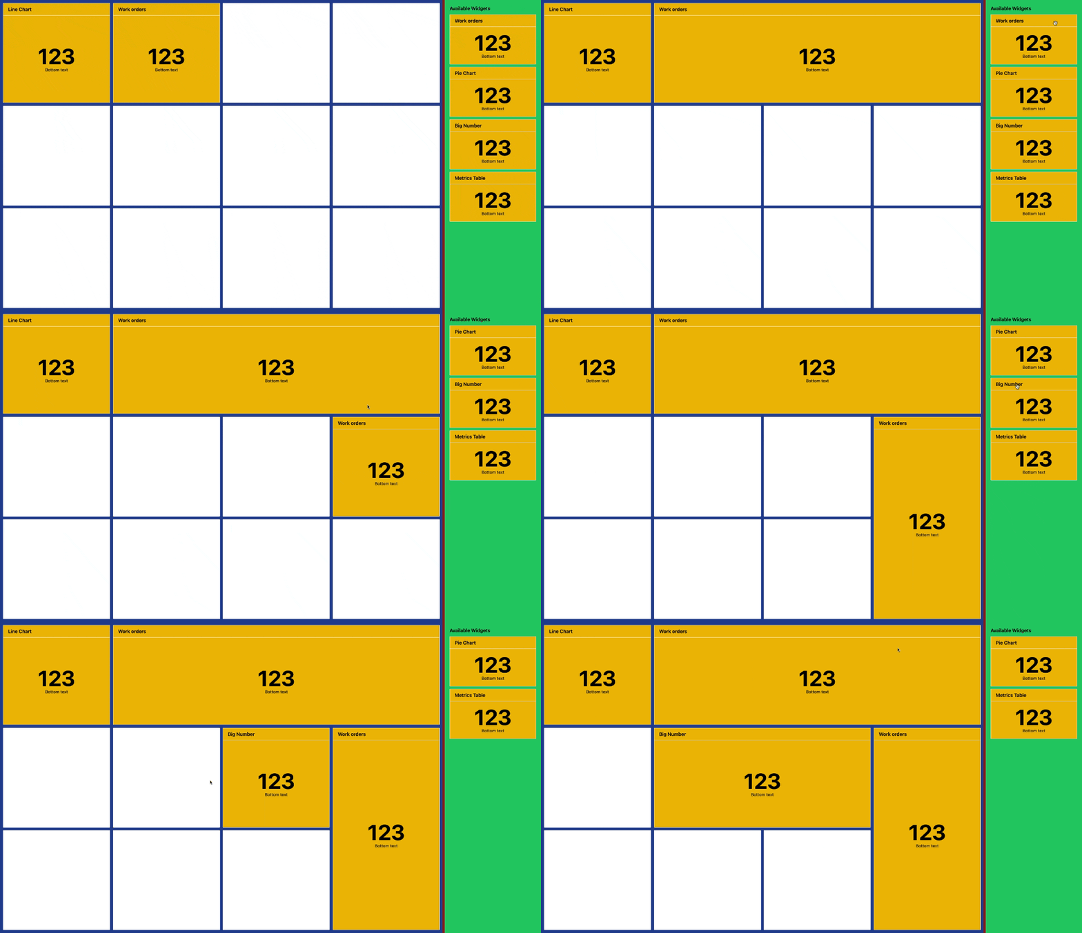
This post demonstrates how to build a React grid layout with draggable and resizable widget components using the react-grid-layout library. We'll put together a simple dashboard where users can rearrange widgets by dragging and resizing them.
Demo: CodeSandbox
package.json
json
{
  "name": "react-vite-ts",
  "private": true,
  "version": "0.0.0",
  "type": "module",
  "scripts": {
    "dev": "vite",
    "build": "tsc && vite build",
    "lint": "eslint . --ext ts, tsx --report-unused-disable-directives --max-warnings 0",
    "preview": "vite preview"
  },
  "dependencies": {
    "@types/react-grid-layout": "1.3.5",
    "react": "^19.0.0",
    "react-dom": "^19.0.0",
    "react-grid-layout": "1.5.0"
  },
  "devDependencies": {
    "@types/react": "^19.0.0",
    "@types/react-dom": "^19.0.0",
    "@typescript-eslint/eslint-plugin": "^8.17.0",
    "@typescript-eslint/parser": "^8.17.0",
    "@vitejs/plugin-react": "^4.3.4",
    "autoprefixer": "10.4.20",
    "eslint": "^9.16.0",
    "eslint-plugin-react-hooks": "^5.1.0",
    "eslint-plugin-react-refresh": "^0.4.16",
    "postcss": "8.4.49",
    "tailwindcss": "3.4.16",
    "typescript": "^5.7.2",
    "vite": "^6.0.3"
  }
}
ReportsGridResizeHandle.css
css
.react-grid-item > .react-resizable-handle.react-resizable-handle-w {
  top: 0 !important;
  bottom: 0 !important;
  height: 100%;
  background: transparent;
  transform: rotate(180deg) !important;
  margin-top: 0 !important;
}

.react-grid-item > .react-resizable-handle.react-resizable-handle-s {
  bottom: 0 !important;
  width: 100%;
  left: 0;
  margin: 0;
  background: transparent;
  transform: rotate(180deg) !important;
  margin-top: 0 !important;
}

.react-grid-item > .react-resizable-handle.react-resizable-handle-e {
  top: 0 !important;
  height: 100%;
  right: 0 !important;
  margin: 0;
  background: transparent;
  transform: rotate(180deg) !important;
  margin-top: 0 !important;
}

.react-resizable-handle::after {
  display: none;
}
types.ts
ts
import { JSX } from "react";
import { Layout } from "react-grid-layout";

export interface Widget {
  id: string;
  title: string;
  component: JSX.Element;
}

export interface WidgetOnLayout {
  position: Layout;
  widget: Widget;
}

export interface UseResizeReturn {
  wrapperWidth: number;
  height: number;
}

export interface WidgetCardProps {
  children: React.ReactNode;
  className?: string;
  draggable?: boolean;
  onDragStart?: (e: React.DragEvent) => void;
}
App.tsx
ts
import { useCallback, useEffect, useState } from "react";
import GridLayout, { Layout } from "react-grid-layout";

import "react-grid-layout/css/styles.css";
import "./ReportsGridResizeHandle.css";
import {
  UseResizeReturn,
  Widget,
  WidgetCardProps,
  WidgetOnLayout,
} from "./types";

// Custom hook to handle responsive resizing of the grid container
const useResize = (): UseResizeReturn => {
  const [dimensions, setDimensions] = useState({ width: 0, height: 0 });

  useEffect(() => {
    // Grab the main container element
    const reportsElement = document.getElementById("reports");

    // Update dimensions whenever the container size changes
    const handleResize = () => {
      if (!reportsElement) return;
      setDimensions({
        width: reportsElement.offsetWidth,
        height: reportsElement.offsetHeight,
      });
    };

    // Use ResizeObserver to watch for container size changes
    const resizeObserver = new ResizeObserver(handleResize);
    if (reportsElement) {
      resizeObserver.observe(reportsElement);
    }

    // Clean up the observer on unmount
    return () => resizeObserver.disconnect();
  }, []);

  // Calculate the height of each grid cell, accounting for gaps
  const totalGapHeight = (GRID_CONFIG.MAX_ROWS - 1) * GRID_CONFIG.GAP;
  const boxHeight = (dimensions.height - totalGapHeight) / GRID_CONFIG.MAX_ROWS;

  return { wrapperWidth: dimensions.width, height: boxHeight };
};

// Header component for each widget with a drag handle
const HeaderItem = ({ title }: { title: string }) => (
  <div className="px-4 py-2 flex cursor-grab items-center justify-between border-b border-silver">
    <div className="draggable-handle text-back font-semibold flex-1">
      {title}
    </div>
  </div>
);

// Example widget content component that displays a large number
const BigNumber = () => (
  <div className="flex h-full flex-col items-center justify-center">
    <div className="text-7xl font-bold">123</div>
    <div className="text-sm">Bottom text</div>
  </div>
);

// Container component for widgets with drag functionality
const WidgetCard = ({
  children,
  className = "",
  draggable,
  onDragStart,
}: WidgetCardProps) => (
  <div
    className={`rounded-sm flex flex-col border border-silver bg-yellow-500 ${className}`}
    draggable={draggable}
    onDragStart={onDragStart}
  >
    {children}
  </div>
);

// Grid configuration constants
const GRID_CONFIG = {
  COLS: 4,
  MAX_ROWS: 3,
  GAP: 20,
} as const;

// Initial set of available widgets
const INITIAL_WIDGETS: Widget[] = [
  {
    id: "1",
    title: "Work orders",
    component: <BigNumber />,
  },
  {
    id: "2",
    title: "Pie Chart",
    component: <BigNumber />,
  },
  {
    id: "3",
    title: "Big Number",
    component: <BigNumber />,
  },
  {
    id: "4",
    title: "Metrics Table",
    component: <BigNumber />,
  },
];

// Initial layout configuration
const INITIAL_LAYOUT: WidgetOnLayout[] = [
  {
    position: { i: "0", x: 0, y: 0, w: 1, h: 1 },
    widget: { id: "0", title: "Line Chart", component: <BigNumber /> },
  },
  {
    position: { i: "2", x: 1, y: 0, w: 1, h: 1 },
    widget: { id: "2", title: "Work orders", component: <BigNumber /> },
  },
];

export default function App() {
  // Get responsive dimensions from the custom hook
  const { wrapperWidth, height } = useResize();

  // State to track widgets on the grid and the available widgets
  const [widgetsOnLayout, setWidgetsOnLayout] =
    useState<WidgetOnLayout[]>(INITIAL_LAYOUT);
  const [availableWidgets, setAvailableWidgets] =
    useState<Widget[]>(INITIAL_WIDGETS);

  // Handle dropping a widget from the sidebar onto the grid
  const handleOndrop = (
    _l: GridLayout.Layout[],
    i: GridLayout.Layout,
    e: Event
  ) => {
    const id = (e as DragEvent).dataTransfer?.getData("text/plain");
    if (!id) throw new Error("Invalid widget ID");

    // Find the dragged widget in the available widgets list
    const draggedWidget = availableWidgets.find((widget) => widget.id === id);
    if (draggedWidget === undefined) throw new Error("Widget not found");

    // Add the widget to the grid and remove it from the available widgets list
    setWidgetsOnLayout((prev) => [
      ...prev,
      {
        position: { i: crypto.randomUUID(), x: i.x, y: i.y, w: 1, h: 1 },
        widget: draggedWidget,
      },
    ]);
    setAvailableWidgets((prev) => prev.filter((widget) => widget.id !== id));
  };

  // Update layout state when widgets are moved or resized
  const handleLayoutChange = useCallback((newLayout: Layout[]) => {
    setWidgetsOnLayout((prev) =>
      newLayout.map((layout) => {
        const widget = prev.find((w) => w.position.i === layout.i)?.widget;
        if (!widget) throw new Error(`Widget not found for layout ${layout.i}`);
        return { position: layout, widget };
      })
    );
  }, []);

  // Build placeholder grid layout
  const placeholderLayout = Array.from({
    length: GRID_CONFIG.COLS * GRID_CONFIG.MAX_ROWS,
  }).map((_, index) => ({
    i: index.toString(),
    x: index % GRID_CONFIG.COLS,
    y: Math.floor(index / GRID_CONFIG.COLS),
    w: 1,
    h: 1,
  }));

  return (
    <div className="gap-2 flex h-full w-full flex-1 bg-red-900">
      {/* Main grid container */}
      <div className="relative h-auto w-full bg-blue-900" id="reports">
        {/* Placeholder grid showing empty slots */}
        <div className="top-0 left-0 absolute h-full w-full">
          <GridLayout
            layout={placeholderLayout}
            cols={4}
            rowHeight={height}
            width={wrapperWidth}
            isDraggable={false}
            isResizable={false}
            maxRows={3}
          >
            {placeholderLayout.map((item) => (
              <div key={item.i} className="rounded-sm bg-white" />
            ))}
          </GridLayout>
        </div>

        {/* Active grid with widgets */}
        <GridLayout
          layout={widgetsOnLayout.map((widget) => widget.position)}
          cols={GRID_CONFIG.COLS}
          rowHeight={height}
          width={wrapperWidth}
          maxRows={GRID_CONFIG.MAX_ROWS}
          isDroppable={true}
          onDrop={handleOndrop}
          resizeHandles={["s", "e", "w"]}
          onResizeStop={handleLayoutChange}
          onDragStop={handleLayoutChange}
          preventCollision={true}
          compactType={"vertical"}
          draggableHandle=".draggable-handle"
        >
          {widgetsOnLayout.map((widget) => (
            <div key={widget.position.i}>
              <WidgetCard className="h-full">
                <HeaderItem title={widget.widget.title} />
                {widget.widget.component}
              </WidgetCard>
            </div>
          ))}
        </GridLayout>
      </div>

      {/* Sidebar with available widgets */}
      <aside className="w-96 p-4 bg-green-600 h-screen overflow-auto">
        <h2 className="font-semibold">Available Widgets</h2>
        {availableWidgets.map((widget) => (
          <WidgetCard
            key={widget.id}
            className="mt-2"
            draggable={true}
            onDragStart={(e: React.DragEvent) => {
              e.dataTransfer.setData("text/plain", widget.id);
            }}
          >
            <HeaderItem title={widget.title} />
            <div className="p-4 flex-1 overflow-auto">{widget.component}</div>
          </WidgetCard>
        ))}
      </aside>
    </div>
  );
}
Leave a comment